Можно ли вырезать пустой круг, используя только CSS?
Это мы все можем сделать:
Но можем ли мы это сделать?
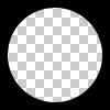
Круг должен быть полым и прозрачным. Таким образом, проблема не решается путем помещения сплошного цветного круга над div.
Можно ли вырезать пустой круг, используя только CSS?
Это мы все можем сделать:
Но можем ли мы это сделать?
Круг должен быть полым и прозрачным. Таким образом, проблема не решается путем помещения сплошного цветного круга над div.
Вы можете получить прозрачный вырезанный круг двумя разными способами:
В следующих примерах используется встроенный svg. В первом фрагменте используется элемент маски, чтобы вырезать прозрачный круг, а во втором пустой круг создается с помощью элемента пути. Круг создается двумя дуговыми командами:
С элементом маски:
body{background:url('https://farm9.staticflickr.com/8760/17195790401_ceeeafcddb_o.jpg');background-size:cover;}<svg viewbox="0 0 100 50" width="100%">
<defs>
<mask id="mask" x="0" y="0" width="80" height="30">
<rect x="5" y="5" width="90" height="40" fill="#fff"/>
<circle cx="50" cy="25" r="15" />
</mask>
</defs>
<rect x="0" y="0" width="100" height="50" mask="url(#mask)" fill-opacity="0.7"/>
</svg>С одним элементом пути:
body{background: url('https://farm9.staticflickr.com/8760/17195790401_ceeeafcddb_o.jpg');background-size:cover;}
svg{
  display:block;
  width:70%;
  height:auto;
  margin:0 auto;
}
path{
  transition:fill .5s;
  fill:#E3DFD2;
}
path:hover{
  fill:pink;
}
<svg viewbox="-10 -1 30 12">
<path d="M-10 -1 H30 V12 H-10z M 5 5 m -5, 0 a 5,5 0 1,0 10,0 a 5,5 0 1,0 -10,0z"/>
</svg>Основные преимущества использования SVG в этом случае:
Создайте div с overflow:hidden; и круглым псевдоэлементом внутри него с радиусом границы. Дайте ему огромную тень блока и без фона:
div{
    position:relative;
    width:500px; height:200px;
    margin:0 auto;
    overflow:hidden;
}
div:after{
    content:'';
    position:absolute;
    left:175px; top:25px;
    border-radius:100%;
    width:150px; height:150px;
    box-shadow: 0px 0px 0px 2000px #E3DFD2;
}
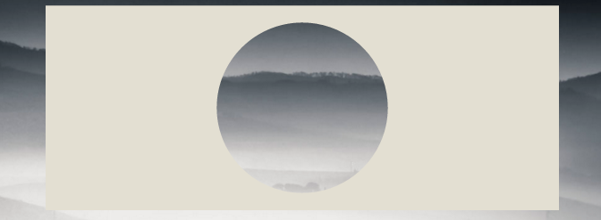
body{background: url('https://farm9.staticflickr.com/8760/17195790401_ceeeafcddb_o.jpg');background-size:cover;}<div></div>Браузер поддерживает box-shadow в IE9+, см. можно использовать
Тот же подход заключается в использовании границы вместо теней. Это интересно, если вам нужно поддерживать браузеры, которые не поддерживают box-shadow, такие как IE8. Техника такая же, но вам нужно компенсировать верхнее и левое значения, чтобы сохранить круг в центре div:
body{
    background: url('https://farm9.staticflickr.com/8760/17195790401_ceeeafcddb_o.jpg');
    background-size:cover;
}
div{
    position:relative;
    width:500px; height:200px;
    margin:0 auto;
    overflow:hidden;
}
div:after{
    content:'';
    position:absolute;
    left:-325px; top:-475px;
    border-radius:100%;
    width:150px; height:150px;
    border:500px solid #E3DFD2;
}<div></div>Это можно сделать с помощью радиального градиента и событий-указателей ( чтобы разрешить взаимодействие с мышью через слой круга, например, выделение текста). Вот демонстрационная страница и скриншот:
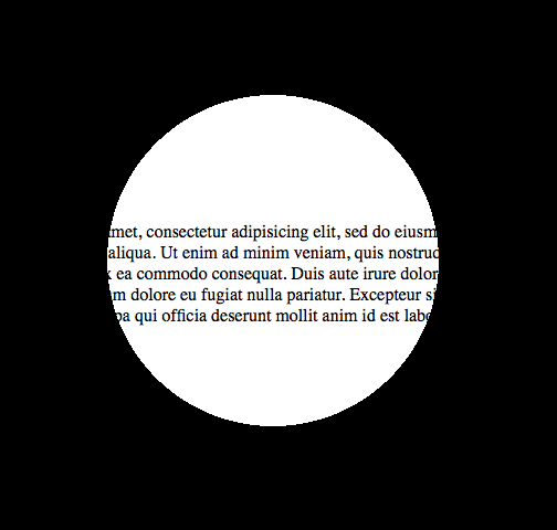
И это будет код для него:
<!DOCTYPE html>

<html>
<head>
<meta charset="UTF-8">
<style type="text/css" media="screen">
body {
  margin: 0;
  padding: 0;
}

.underneath {
  padding: 0;
  margin: 265px 0 0 0;
  width: 600px;
}

.overlay {
  top: 0;
  left: 0;
  position: absolute;
  width: 600px;
  height: 600px;
  background: -moz-radial-gradient(transparent 150px, rgba(0,0,0,1) 150px);
  background: -webkit-radial-gradient(transparent 150px, rgba(0,0,0,1) 150px);
  background: -ms-radial-gradient(transparent 150px, rgba(0,0,0,1) 150px);
  background: -o-radial-gradient(transparent 150px, rgba(0,0,0,1) 150px);
  pointer-events: none; /* send mouse events beneath this layer */
}
</style>
</head>
<body>

<p class="underneath">
  Lorem ipsum dolor sit amet, consectetur adipisicing elit, sed do eiusmod tempor
  incididunt ut labore et dolore magna aliqua. Ut enim ad minim veniam, quis
  nostrud exercitation ullamco laboris nisi ut aliquip ex ea commodo consequat.
  Duis aute irure dolor in reprehenderit in voluptate velit esse cillum dolore
  eu fugiat nulla pariatur. Excepteur sint occaecat cupidatat non proident, sunt
  in culpa qui officia deserunt mollit anim id est laborum.
</p>

<div class="overlay"></div>

</body>
</html>
pointer-events. Если размер отличается, вы можете создавать маски из SVG для WebKit developer.mozilla. org/en/CSS/-webkit-mask и Firefox developer.mozilla.org/En/ Применение_SVG_effects_to_HTML_content
- person Ionuț G. Stan; 27.11.2011
background: radial-gradient(circle at center,, чтобы создать идеальный круг независимо от ширины/высоты снизу.
- person seanjacob; 28.02.2019
Ссылаясь на ответ веб-тики, я хотел бы добавить, что вы всегда можете центрировать div с помощью translate(-50%,-50%), поэтому не составит труда использовать свойство border, которое лучше поддерживается браузером.
div{
    position:relative;
    width:500px;
    height:200px;
    margin:0 auto;
    overflow:hidden;
}
div:after{
    content:'';
    position:absolute;
    left:50%;
    top: 50%;
    transform: translate(-50%,-50%);
    border-radius:50%;
    width:150px; height:150px;
    border: 1000px solid rebeccapurple;
}

body{background: url('https://farm9.staticflickr.com/8760/17195790401_ceeeafcddb_o.jpg');background-size:cover;}<div></div>Вы можете проявить творческий подход с этой техникой:
document.addEventListener( "DOMContentLoaded", function(){
	setInterval(function(){
		if(document.getElementById("moving").style.height === "500px"){
			document.getElementById("moving").style.height = "0px";
		} else {
			document.getElementById("moving").style.height = "500px";
		}
	}, 2000);
});
#container {
width: 500px;
margin: 0 auto;
border: 1px solid black;
overflow:hidden;
position: relative;
}
#circle{
position:relative;
height:150px;
margin:0 auto;
clear:left;
overflow:hidden;
}
#circle::before, #circle::after {
content:'';
border-radius:50%;
position: absolute;
left: 50%;
top: 50%;
transform: translate(-50%,-50%);
}
#circle::before {
height: 140px;
width: 140px;
background: rebeccapurple;
}
#circle::after{
width:150px;
height:150px;
border: 2000px solid rebeccapurple;
}
#line {
margin: 0 auto;
width: 6px;
height: 200px;
position: relative;
}
#line::before, #line::after {
content: " ";
background-color: rebeccapurple;
height: 200px;
width:2000px;
position:absolute;
}
#line::before {
right: 100%;
}
#line::after {
left: 100%;
}
#moving {
height: 0px;
width: 100%;
background: blue;
transition: 2s height;
position: absolute;
top: 0px;
z-index: -1;
}
body{
background: url('https://farm9.staticflickr.com/8760/17195790401_ceeeafcddb_o.jpg');background-size:cover;
}<div id="container">
<div id="circle"></div>
<div id="line"></div>
<div id="circle"></div>
<div id="moving"></div>
</div>Что касается «Метода 1» от «Pius Nyakoojo», с небольшим улучшением (см. ниже) он будет работать. Я лично думаю, что это самое простое решение:

<html>
<!-- Assuming the stuff to mask is a 100 pixel square -->
<style>
.mask {
    position: absolute;
    top: -50px;                     /* minus half the div size */
    left: -50px;                    /* minus half the div size */
    width: 100px;                   /* the div size */
    height: 100px;                  /* the div size */
    background-color: transparent;
    border-radius: 100px;           /* the div size */
    border: 50px solid white;       /* half the div size */
    pointer-events: none;           /* send mouse events beneath this layer */
}

.stuff {
    position: absolute;
    width: 100px;                   /* the div size */
    height: 100px;                  /* the div size */
    overflow: hidden;               /* hide the excess of the mask border */
    background-color: #CCC;
}
</style>
<body>
    <div class="stuff">
        <div class="mask"></div>
        blah blah blah blah blah
        blah blah blah blah blah
        blah blah blah blah blah
    </div>
</body>
</html>
Способ 1 — предпочтительнее
<div class="circle"></div>
$radius: 50px;
$thickness: 5px;

.circle {
    width: $radius;
    height: $radius;
    background-color: transparent;
    border-radius: $radius;
    border: $thickness solid gray;
}
Способ 2
<div class="circle"></div>
$radius: 50px;
$thickness: 5px;

.circle {
  width: $radius;
  height: $radius;
}

.circle::before, .circle::after {
  margin: -2px 0;
}
.circle::before {
    content: '';
    display: inline-block;
    width: $radius;
    height: calc(#{$radius} / 2);
    background-color: transparent;
    border-top-left-radius: calc(#{$radius} / 2);
    border-top-right-radius: calc(#{$radius} / 2);
    border: $thickness solid gray;
    border-bottom: 0;

    -webkit-box-sizing: border-box;
    -moz-box-sizing: border-box;
    box-sizing: border-box;
}

.circle::after {
  content: '';
  display: inline-block;
  width: $radius;
  height: calc(#{$radius} / 2);
  background-color: transparent;
  border-bottom-left-radius: calc(#{$radius} / 2);
  border-bottom-right-radius: calc(#{$radius} / 2);
  border: $thickness solid gray;
  border-top: 0;

  -webkit-box-sizing: border-box;
  -moz-box-sizing: border-box;
  box-sizing: border-box;
}
Вы можете сделать это, используя маски css и дополнительное изображение svg.
Хотя поддержка браузера слабая

body {
  background: url(https://data.whicdn.com/images/50959200/original.jpg);
  background-size: cover;
  background-position: center;
}

.circle {
  width: 150px;
  height: 150px;
  background: black;
  border-radius: 50%;
  -webkit-mask: url(https://svgshare.com/i/GLf.svg);
  -webkit-mask-size: 125%; /* change it */
  -webkit-mask-position: center;
  margin: 20px auto;
}
<div class="circle"></div>Мы можем сделать это с помощью radial-gradient и mask. С одним div, без псевдоэлемента.
* {
  box-sizing: border-box;
}

html,
body {
  height: 100%;
}

body {
  margin: 0;
  background-image: url(https://picsum.photos/id/1060/720/1280);
  background-size: cover;
}

.a {
  /* this is flexible. you can change */
  --circle-radius: 100px;
  height: 100%;
  width: 100%;
  --mask: radial-gradient(circle farthest-side at center center, transparent var(--circle-radius), #000 calc(var(--circle-radius) + 2px) 100%) 50% 50%/100% 100% no-repeat;
  -webkit-mask: var(--mask);
          mask: var(--mask);
  background: #000;
}
<div class="a"></div>Радиус круга также может быть процентным значением:
* {
  box-sizing: border-box;
}

html,
body {
  height: 100%;
}

body {
  margin: 0;
  padding: 30px;
  background-image: url(https://picsum.photos/id/1060/720/1280);
  background-size: cover;
}

.a {
  --circle-radius: 20%; /* changed as percent value */

  height: 100%;
  width: 100%;
  --mask: radial-gradient(circle farthest-side at center center, transparent var(--circle-radius), #000 calc(var(--circle-radius) + 2px) 100%) 50% 50%/100% 100% no-repeat;
  -webkit-mask: var(--mask);
          mask: var(--mask);
  background: rgba(0, 0, 0, .8);
}
<div class="a"></div>Другая идея:
* {
  box-sizing: border-box;
}

html,
body {
  height: 100%;
}

body {
  margin: 0;
  background-image: url(https://picsum.photos/id/1060/720/1280);
  background-size: cover;
}

.a {
  --circle-radius: 100px;
  --border-width: 30px;

  height: 100%;
  width: 100%;
  --mask: radial-gradient(circle farthest-side at center center, transparent var(--circle-radius), #000 calc(var(--circle-radius) + 2px) calc(var(--circle-radius) + 2px + var(--border-width)), transparent calc(var(--circle-radius) + 2px + var(--border-width) + 2px) 100%) 50% 50%/100% 100% no-repeat;
  -webkit-mask: var(--mask);
          mask: var(--mask);
  background: #000;
}
<div class="a"></div>Обратный:
* {
  box-sizing: border-box;
}

html,
body {
  height: 100%;
}

body {
  margin: 0;
  background-image: url(https://picsum.photos/id/1060/720/1280);
  background-size: cover;
}

.a {
  --circle-radius: 100px;
  --border-width: 30px;

  height: 100%;
  width: 100%;
  --mask: radial-gradient(circle farthest-side at center center, #000 var(--circle-radius), transparent calc(var(--circle-radius) + 2px) calc(var(--circle-radius) + 2px + var(--border-width)), #000 calc(var(--circle-radius) + 2px + var(--border-width) + 2px) 100%) 50% 50%/100% 100% no-repeat;
  -webkit-mask: var(--mask);
          mask: var(--mask);
  background: #000;
}
<div class="a"></div>